Stamp creation
Stamp creation is a sequence, and doing it out of order is why homemade stamps look wrong. The outline decides how much text will fit. The ring text decides how much room is left in the middle. The centre element has to live in what remains. Choosing a logo first and then discovering the company name will not fit around it is the usual way this goes badly.
Templates you can start from
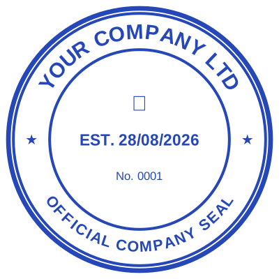

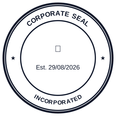

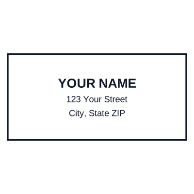

How to make it
- Outline first: shape and diameter. Everything else fits inside it.
- Ring text second: the longest line decides the font size.
- Centre third: whatever space is genuinely left.
- Spacing last: pull anything away from the border.
What you get
- A working order that avoids rebuilding
- Live preview at every step
- Undo, so a wrong turn costs nothing
- Millimetre sizing from the first decision
The mistake almost everyone makes
Setting the font size before the longest line is written. The ring text has to fit the circumference, and the circumference is fixed by the diameter you chose in step one. Type the longest line first, at the size you want, and if it does not fit you have two honest options: a bigger stamp or fewer words. Shrinking the font until it fits is the third option and it produces a stamp nobody can read at 40mm.
Questions
What if the wording will not fit?
Increase the diameter or cut words. A registered name has to stay exact, so the words to cut are usually the ones underneath it: an address can move to a rectangular stamp beside the seal rather than squeezing into the ring.
How small can the text go?
Below about 6pt at 40mm it stops surviving a photocopy, which is usually where a stamped document ends up. If the design needs text smaller than that, the stamp is too small for the words.
Estamplab is a design tool. This page describes common commercial practice rather than giving legal advice, and practice changes. Where a specific document matters, check the requirement with the body receiving it. Only produce a mark your own organisation or your own credentials are entitled to use.