Blog › Stamp templates and design
Round stamps and circular seals: designing the ring
29 August 2026 · Estamplab
Make your stamp free · Browse 225 templates

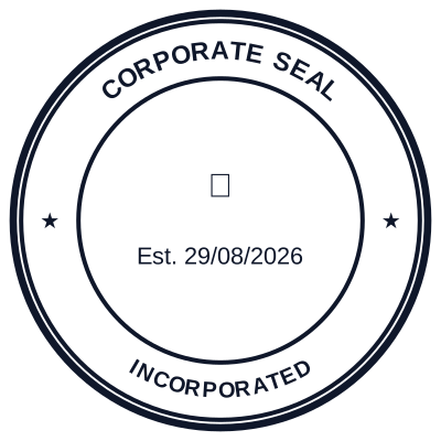


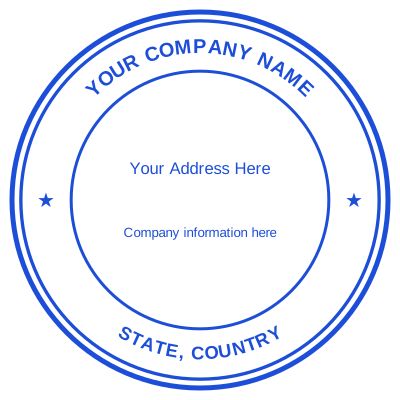

Open the stamp maker and start from any of these
The round seal is the most recognisable mark in stamping. It is also the easiest to get wrong, because curved text is harder to read than anybody laying it out expects, and the problem only shows up at actual size.
The anatomy of a round stamp
Four parts, and the names matter because they are what you will be adjusting. The border, which can be a single line, a double circle, or a scalloped edge of the kind a notary seal uses. The ring text, curved along the top and the bottom. The centre block. And the emblem, if there is one: a star, a crest, the scales of justice on a legal seal, a caduceus on a medical one. Letter spacing is the control that separates a ring which reads from one that crowds, and it is the one most free makers do not give you.
Working inwards:
- The outer border. One heavy ring, or a heavy ring with a hairline inside it. Two heavy rings crowd everything else.
- The upper arc, curving along the top and read left to right. This carries the organisation name, because it is the first thing the eye lands on.
- The lower arc, curving along the bottom. Conventionally read left to right as well, which means the letters sit upside down relative to the top arc. This is normal and correct: reversing it so both arcs read the same way around is the mark of a design made by somebody who has not looked at many seals.
- The separators, usually a star or a dot where the two arcs meet at the sides. They stop the text running into itself.
- The centre, flat and horizontal. Everything you actually need somebody to read goes here.
The rule that decides whether it works
Names curve. Numbers do not.
A registration number, a licence number, a commission number or a date set around a curve is materially harder to read than the same characters set flat, and those are exactly the lines somebody will be checking. Put the organisation name on the arc, where it is recognised rather than read character by character, and put every number flat in the middle.
The curved text stamp maker re-fits the ring as you type, so the spacing stays even when the name changes length.
Sizes
38mm and 40mm across are the workhorses. That is enough for an outer ring of text, an inner ring, and two or three short lines in the centre.
30mm is the compact size, and it holds a name and one line. 45mm to 50mm is used where a seal genuinely has to carry a lot, and it starts to look ceremonial rather than practical.
The company stamp size guide covers what fits in each, and stamp shapes and sizes compares the round form with the others.
The mistakes
Too much text on the ring. A long name in small type around a 38mm circle is a mark nobody reads. Shorten it, or move part of it to the centre.
Both arcs reading the same direction. The lower arc is conventionally set the other way up. Getting this wrong is subtle and instantly recognisable to anybody who handles documents.
The number set smallest. The registration number is the only line a reader can verify and it is invariably the line set smallest. Preview at actual size, not at screen size.
Three rings of text. Each additional ring shrinks the type. Two is the practical maximum at 38mm.
A detailed logo in the centre. Fine detail softens badly at this size. A simplified mark works; the full brand lockup does not.
Where the round form belongs
Anything being executed, certified or issued: a company seal, a common seal, a notary stamp, a professional seal, a government or institutional mark, a certificate. The circle is what makes a mark read as a seal rather than a label.
Where the information matters more than the ceremony, use a rectangle instead. An address block, a received mark with fields to fill in, or a bank endorsement all read better as straight stacked lines.
Make one in the round stamp maker, or start from a layout above.
Two things this page is not. It is a description of what these marks are and how they are laid out, not advice on when one is legally required: that is set by the body receiving the document and it differs by country. And a design tool makes the mark, not the standing behind it, so only ever produce a stamp you are entitled to use.
Common questions
What size should a round company seal be?
38mm or 40mm in diameter. Those are the sizes readers are used to and they are large enough for a registration number to stay legible on a photocopy.
Which way should the bottom text curve?
Conventionally the reverse of the top, so the letters at the base sit upside down relative to the ones at the crown. Almost every official seal you have seen does this.
What goes in the middle of a round seal?
The lines that must be read exactly: the registration number, the year, a licence number, or a simple device such as a star. Keep them flat and horizontal.
Can a round stamp have a logo?
Yes, in the centre, provided the logo survives at that size. Simplify it if it does not. Turning a logo into a stamp removes the white background so it prints as ink rather than as a white box.
Why does my round stamp look cramped?
Almost always too much ring text, or two rings where one would do. Move detail into the centre, or shorten the name on the arc.
Read next: stamp shapes and sizes, and corporate stamps and seals.
Every kind of stamp and seal
- Notary stamps and seals
- Rubber stamps
- Rubber stamp maker
- Self-inking stamps
- Office stamps
- Official stamps
- Company seals
- Corporate stamps and seals
- Company chops
- Seals for civil servants
- Justice and court stamps
- Legal and advocate stamps
- Certified true copy stamps
- Medical stamps
- Pharmacy stamps
- Veterinary stamps
- Engineer and architect seals
- Land surveyor seals
- Bank stamps
- School and principal stamps
- Teacher and marking stamps
- University and college seals
- Library stamps
- Inspection stamps
- Courier and logistics stamps
- Construction and site stamps
- Real estate stamps
- Hotel and restaurant stamps
- Church and charity seals
- Tender and bid stamps
- HR and payroll stamps
- Received and paid stamps
- Confidential and draft stamps
- Signature stamps
- Date stamps
- Custom band stamps
- Numbering stamps
- Address stamps
- Monogram stamps
- Wedding stamps
- Gift and craft stamps
- Art and logo stamps
- Wax and foil seals
- Stamp or seal, by profession