Blog › Stamp templates and design
Create a digital stamp
30 August 2026 · Estamplab
Make your stamp free · Browse 225 templates






Open the stamp maker and start from any of these
Most digital stamps fail for the same two reasons: too much text, and a number nobody checked. The design part is easy. Deciding what belongs on the mark, and in what order, is the part that determines whether the document comes back.
This is the build, step by step, with the decision at each stage and the mistake that usually goes with it.
Step 1: decide what the stamp has to prove
Before choosing a shape, answer one question. What does the person receiving this document need to know?
- Which company is speaking. Then you are building a company stamp, and the registration number is the most important line on it.
- That the document arrived, and when. Then you are building a dated received stamp, and the date matters more than the name.
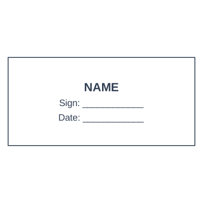
- Who authorised it. Then you are building a signature block: name, role, and a line to sign on.
- What state the document is in. PAID, COPY, CANCELLED, DRAFT. Then you need one bold word and nothing else.
Most businesses need three marks, not one, and they are usually the first three above. Trying to make one stamp do all three is how you end up with eight lines of six point text that nobody can read.
Step 2: let the content pick the shape
Shape is not taste, it is capacity.
- Rectangle for anything with more than three lines. It holds a company name, an address and a registration number at a size that survives a photocopy. Most business stamps should be rectangles.
- Round, 38 to 40 mm, when the mark needs to read as institutional: certificates, resolutions, schools, professional bodies. The name curves around the ring and the middle stays clear.
- Oval when the name is too long for a circle but you still want the formal look.
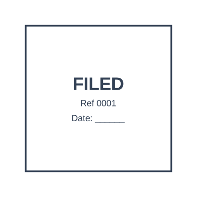
- Square for filing and status marks.
Below about 30 mm, text curved around a ring starts closing up and disappears when printed. The size guide shows what fits in each.
Step 3: write the lines in priority order
Put the line the recipient can verify at the top of your list, not the bottom. That is nearly always the number: the company registration number, the VAT number, the professional registration.
A working order for a company stamp:
- Registered name, in full, exactly as registered. Not the trading name everyone uses.
- Registration number.
- Address, one or two lines.
- Phone or email, only if there is room left.
What does not belong: a slogan, a website you might change, and anything you will not want to re-cut in two years.
Then read the number character by character. It is the single line most often engraved wrong, and it is also the only one anybody can check.



Open the stamp maker and start from any of these
Step 4: make the date and the number automatic
This is where a digital stamp stops imitating a rubber one and starts beating it.
A rubber date stamp has bands somebody has to turn. On Monday morning nobody turns them, so Monday's document goes out carrying Friday's date, and the value of dating it at all is gone. A digital stamp can carry a date placeholder that resolves when the stamp is used, so it is right without anybody remembering. See the date stamp generator.
The same applies to numbering. A mechanical numberer advances a counter; a digital one can hold a serial placeholder that moves on by itself, which is what you want for invoices, delivery notes, files and batches. See sequential numbering.
If you build only one thing differently from your old rubber stamp, build this.
Step 5: add the logo, carefully
Upload the file and the white background is removed, so the logo prints as ink rather than as a white rectangle pasted over the page.
The mistake here is scale. A logo with fine linework, a gradient or small lettering looks superb at screen size and turns into a grey smudge at 38 mm. Check the preview at actual size, and if it does not survive, use a simplified version: many companies keep a single-colour mark specifically for stamps. More on logos.
Step 6: pick a colour that carries meaning
- Blue is the commercial default, because it separates an original from a black and white photocopy at a glance.
- Black reads as the most formal and is usual on legal documents.
- Red should be reserved for status: CANCELLED, PAID, URGENT, CONFIDENTIAL. Using red for a company stamp spends a signal you will want later. See red stamps.
Step 7: download the right format
This is the step that decides whether the stamp works when you use it.
- Transparent PNG for placing on a document. The transparency is not cosmetic: without it the stamp lands as a white box that hides the text underneath. Transparent PNG explained.
- SVG if it is going to an engraver for a physical stamp, or if you need to scale it. A vector cuts far cleaner than a photograph of an old impression.
- PDF when you are sending somebody the stamp itself rather than applying it.
The formats compared, if you want the detail.
Step 8: test it before you rely on it
Two checks, one minute each, and they catch nearly everything.
Print it at real size. Not zoomed to fill a page. At 38 mm, on a normal printer. If the registration number is not readable, the stamp is too busy and a line has to go.
Put it on a real document and photocopy it once. That is how your mark will usually be seen: not on your screen, but after it has been through somebody else's scanner. Anything that survives that is a working stamp.
Frequently asked questions
How do I create a digital stamp for free?
Open the stamp maker, choose a template, replace the wording with your own, and download. Designing and previewing costs nothing and needs no account. A physical version through an engraver is the part that costs money and takes days.
What is the difference between a digital stamp and a scanned rubber stamp?
A scan is a photograph of an impression: it carries the paper's grey, the shadow, the skew, and it degrades every time somebody forwards the file. A digital stamp is drawn at full resolution with a transparent background, so it stays sharp and sits on the page like ink. If you already have a scan, treat it as a reference for redrawing rather than as the stamp itself.
What size should a digital stamp be?
Design it at the size it will be used. A round company seal is usually 38 to 40 mm across; a rectangular business stamp around 58 by 22 mm. Working at the real size stops you writing eight lines that only look fine because you were zoomed in.
Can a digital stamp include a date that updates?
Yes, and it is the main reason to build one. A date placeholder resolves when the stamp is applied, so the document carries the day it was actually stamped rather than whatever the bands were last set to.
How many stamps does a small business actually need?
Three covers most of it: the company stamp for commercial documents, a dated RECEIVED stamp for anything arriving, and a signature block with a name and role. Add others when a need appears, not before. Organising a set covers how to keep them straight.
Will a digital stamp be accepted?
That depends on who is receiving the document, and it varies by country, by institution and by document type. Many organisations accept an applied stamp on commercial paperwork as a matter of routine; regulated documents are a different question and the receiving authority decides. What the law actually says goes into this properly.
Only make the stamp you are entitled to use. Reproducing the mark of a notary, a government office or a professional body without holding that position is not design work, it is forgery, and it is prohibited and prosecuted as such.
This guide describes common commercial practice and is a design tool rather than legal advice. Where a stamp's content is regulated, which covers notaries, professional bodies and healthcare, what may appear on it is set by the authority that requires the document.
Read next: stamp templates, put a stamp on a PDF and company stamp sizes.
Every kind of stamp and seal
- Notary stamps and seals
- Rubber stamps
- Rubber stamp maker
- Self-inking stamps
- Office stamps
- Official stamps
- Company seals
- Corporate stamps and seals
- Company chops
- Seals for civil servants
- Justice and court stamps
- Legal and advocate stamps
- Certified true copy stamps
- Medical stamps
- Pharmacy stamps
- Veterinary stamps
- Engineer and architect seals
- Land surveyor seals
- Bank stamps
- School and principal stamps
- Teacher and marking stamps
- University and college seals
- Library stamps
- Inspection stamps
- Courier and logistics stamps
- Construction and site stamps
- Real estate stamps
- Hotel and restaurant stamps
- Church and charity seals
- Tender and bid stamps
- HR and payroll stamps
- Received and paid stamps
- Confidential and draft stamps
- Signature stamps
- Date stamps
- Custom band stamps
- Numbering stamps
- Address stamps
- Monogram stamps
- Wedding stamps
- Gift and craft stamps
- Art and logo stamps
- Wax and foil seals
- Stamp or seal, by profession